Canvas architecture
Workspace explorations
1 Early exploration
The early layout already brought chat, the workflow, and outputs together. The question was how these areas should work together.
2 Editing nodes
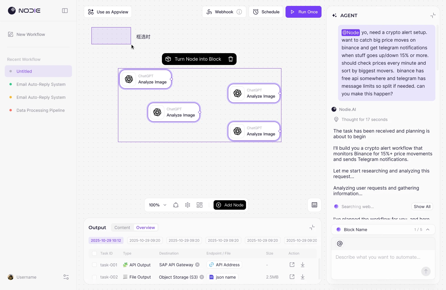
Node settings sit in a side panel, with the canvas in the center and an output overview below.
3 The complete workspace
Generation, editing, and results stay tied to the current workflow, so people can refer to its structure while working on a node.
The problem and design requirements
AI gives people a starting point. Once it generates a workflow, they still need to ask: did it understand my goal? Are the tools and steps right? What still needs configuring? My design needed to help people understand the workflow and take over the editing.
A request in chat eventually becomes nodes, connections, and parameters. People move between clarifying the request, checking the structure, changing settings, and reviewing outputs. They need to know which step they are editing and whether the change worked as expected.
Builders need control over individual steps. Someone opening a shared link may only want to complete a task. The product needs to support both: inspecting the implementation and understanding or using the workflow at the task level.
Turning a goal into a workflow people can inspect and edit
People can describe a task in chat or build directly on the canvas. After AI generates a plan, they need to see which tools it uses, how the steps connect, and what information is missing. I focused on connecting the request to its implementation so people could finish the workflow themselves.
Chat describes the goal. The canvas shows how it works. After checking the nodes and connections, people can return to chat to clarify a request or edit a node directly. The canvas is where they understand and adjust the workflow.
Each run informs the next edit. If the result is wrong, people can inspect the relevant step or clarify the goal.
Final deliverables and step outputs help people check whether the workflow ran as expected. Keeping the workflow, settings, and results in one workspace makes them easier to compare and reduces the need to search across views.
Different users need different levels of detail. Builders work on individual steps with Node and switch between a task overview and its internal structure with Block. People using a shared link can fill in inputs and get results in Appview. Each view supports a different way of working with the same workflow.
How the panels work together
Describing a request, editing the structure, and checking results are all part of the same task. People need to inspect the actual workflow alongside the conversation, and keep the goal in mind while configuring a node.
I made the canvas the center of the workspace, placed chat and settings on the right, and put outputs below the canvas. Each area has a specific job, while the workflow stays visible as people generate, edit, and check it.
Workspace overview
The canvas leads, with chat, settings, and outputs tied to the current workflow.
Request and generation
Describe the task in chat, then inspect the generated nodes and connections on the canvas.
Node settings
Keep the workflow visible while editing a node's fields, parameters, and authorization.
Run and review
Compare outputs with the workflow to check the run and find what needs changing.
The diagrams mark the areas used for each task.
Workflow canvas
The canvas is where people understand and edit a workflow. Nodes describe the actions, connections show their order, and Block groups related steps into a task.
The full workflow remains visible while people add, select, or adjust nodes.
1Nodes and connections
Follow the connections to inspect how the task works.
2Canvas toolbar
Keep view controls and Add Node inside the workspace.
Chat panel
From the first request through planning, building, and completion, the chat panel needs to explain what AI is doing, which object it is working on, and when the user needs to act.
The plan and status updates explain the build; @ references point follow-up requests to a Node or Block. Authorization cards provide an action when the user needs to step in.
The goal and referenced objects
The original request and @ tags keep the task and its references visible.
Show what is happening
Acknowledgment, analysis, and search updates make progress visible.
Task plan
List the next steps before generating nodes and Blocks.
Search feedback: in progress or complete
People can expand the search progress, where completed items appear darker. When the search ends, a tool count summarizes the result, with Show All available for the details.
Search in progress
Expand the tools being checked and distinguish completed items from those still in progress.
Search complete
After completion, “Searched 3 tools” replaces the expanded list to save space in the conversation.
Build progress: summary and detail
The progress bar shows the current Block and task count. Expanding it reveals which steps are complete, generating, or waiting. Generating and Pending have distinct states.
Generating
A purple status indicator appears with the current Block and progress count.
Waiting
A waiting indicator identifies a step that has not continued yet.
@ references: specify what to change
“Change this” needs a specific target. People can type @ to select a Node or Block, or use the @ control to select several objects before adding their request.
Type @ to reference one object
Selecting an object closes the picker and inserts a reference tag into the message.
Use the @ control for multiple objects
Selected objects appear above the input. Clicking outside the picker closes the list.
Reveal removal on hover
Hovering over a reference tag turns its icon into a close control so the reference can be removed.
Long names and multiple references
Long names are truncated. Extra objects sit behind +N, with a way to view the list.
Authorization: waiting or failed
When a service needs connecting, a Required Permissions card appears in chat. It shows Pending during authorization and a retry action after failure, separate from the workflow's build status.
Waiting for a connection
Name the required service and provide a Connect with Google action.
Authorization in progress
After the authorization window opens, the button shows Pending and keeps the service information visible.
Authorization failed
A failure state and Try again show what to do next. The designs distinguish Auth failed, Login expired, and Unauthorized.
Output panel
After a run, people need to identify the output, know which run produced it and where it went, and retrieve it.
Content shows card previews; Overview lists tasks, types, destinations, and file details in a table. Both views support reviewing runs, adjusting the panel height, and retrieving outputs.
Two views for different checks
Content helps people recognize an output. Overview lets them inspect its structured details. Both keep run times above the results so outputs from separate runs are easy to distinguish.
Content: preview outputs
Image, media, and link cards show the type, name, and size so people can identify what to open.
Overview: inspect output details
Each row lists Task ID, Type, Destination, Endpoint / File, Size, and Action.
Expand the panel to inspect more outputs
The default height leaves room for the canvas. Expanding the panel reveals more outputs. JSON, Excel, PDF, Markdown, images, video, and audio within a task each use an icon, thumbnail, or media indicator.
Type and destination
Distinguish API, file, text, and Web UI outputs and show their destinations.
Content and actions
Keep filenames, links, previews, and sizes in the task row, with open and download actions on the right.
Show the resize handle on hover
Hovering over Output reveals a handle at the top for adjusting the panel's height.
Identify the run and selected outputs
Run times sit in a horizontal list. The active time and selected rows have distinct emphasis. The selection state includes Download All, while each row keeps its open and download actions.
The active run and selection
Time labels identify the run being viewed. Checkboxes and row highlights identify the selected outputs.
Keep retrieval actions near the content
Download All sits at the top. Each row has individual open and download actions, emphasized on hover.
Building on the canvas
When working on a node, people need to find the control, understand its action, and configure it within the current workflow.
Adding and configuring nodes
People start with Add Node, then choose a capability and fill in fields and parameters in the side panel. The node's position stays visible on the canvas while they configure it.
Service icons and labels identify the tool. The action name explains what the node does, and connections link those actions into a workflow.
Choose a capability
Browse categories or search for a capability, or describe the node in Add Node for me.
Configure a node
Name the node, choose authorization, and edit parameters in one panel. Table and Tree provide two ways to inspect the parameters.
Define inputs
Set a name, type, required status, and default value for each input so the task's information needs are clear.
Giving complex structures a visible boundary
Branches, loops, and groups of nodes need different visual treatments. Connections show branches, a Loop container defines what repeats, and Block organizes related tasks.
The interaction rules need to be clear too. In the Loop design, more than 50% of a node must enter the container to be included; Ctrl-drag removes it. A Block cannot go inside a Loop, and external nodes cannot connect directly to internal nodes.
The visible grouping needs to match the interaction rules.
View the Loop rules +
Making interaction states readable
Hover shows what the pointer is over, selection shows the active object, and the toolbar offers the next actions. Errors and authorization prompts appear on the relevant node so people can locate what needs attention.
Reveal connection controls on hover
The default state stays simple. Hover reveals connection points, with further guidance as the pointer approaches them.
Tie tools to the selected object
The border, glow, and nearby toolbar identify the active object.
Locate the issue on the node
Red error indicators and yellow authorization indicators appear on the relevant nodes. Hover reveals Fix or Auth.
AI and the canvas
People can start by describing a task in chat, then inspect the generated structure on the canvas. Together, these views support the work from the first request to a workflow ready to run.
From a request to a structure
The Agent restates the goal and proposes a build plan, breaking the task into steps such as triggering, preparing data, organizing results, connecting services, and testing. People can review that plan before the nodes are generated.
Build updates stay tied to the relevant Block and nodes. Progress shows the current step, and @ references give follow-up requests a specific target.
After generation, people can inspect the structure on the canvas and open a node's settings to adjust its parameters.
Making the handoff actionable
Fields, service authorization, and workflow review all need clear controls. Node settings and authorization prompts let people inspect and complete what AI has generated.
The authorization dialog names the service and permissions needed so people know what to do next. My goal was to make the build understandable and give people a way to finish it themselves.
Block: switching between the task and its details
When several nodes work together on a task, Block provides an overview and a way to open the steps for closer inspection.
A familiar node card that reads as a group
We spent time discussing the shape of Block. We wanted it to feel familiar as a node card while making it clear that it contained several steps.
The overview uses several icons to suggest its contents, a name to identify the task, and a description to explain its purpose. When expanded, a boundary surrounds the nodes and connections so people can read it like the rest of the canvas.
People opening a shared link can first see what each part does, then decide whether to inspect the details.
Switching the view
Hover over a Block to reveal its toolbar. Overview folds it into a summary. The level of detail changes within the same workflow, while the incoming and outgoing connections remain visible.
Read the task, then inspect the steps
The overview shows relationships between tasks. The detailed view supports inspecting individual nodes.
Switch beside the object
The toolbar stays with the Block, keeping the interaction in the same place as the view changes.
Keep detail where it is needed
Nodes and Blocks can sit together, with only the parts that need inspection left open.
View the full Block designs +
Folding away the steps puts more weight on the name and description. Whether people can recognize the task and find the view control still needs validation.
From Workflow to Appview
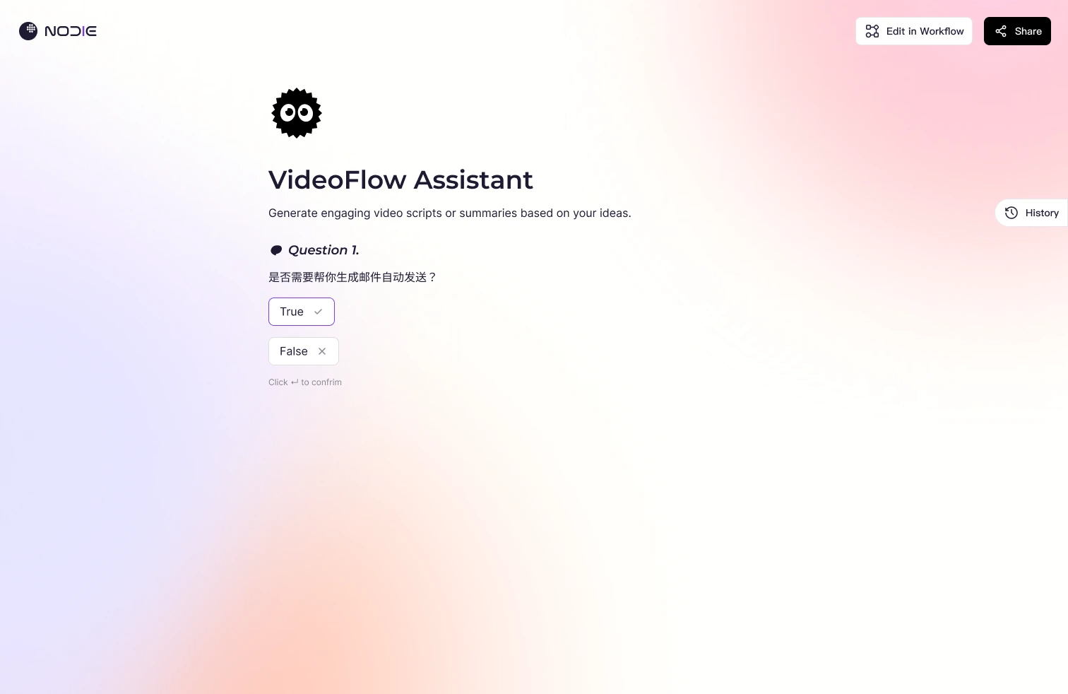
Builders need to understand how the workflow works. People using the app need to complete their task. Appview organizes that experience around questions, inputs, and results.
Turning field rules into questions
Builders define questions, types, required fields, and defaults in the Input node. People answer those questions in Appview. Both use the same configuration for different tasks.
The configuration view needs complete rules. The app needs to explain what to provide, how to provide it, and what to do next.
Input node: collecting different kinds of information
A task may need text, numbers, choices, a toggle, or attachments. The Input node supports Text, Number, Single Select, Multiple Select, Boolean, and File through a shared configuration pattern. Builders choose the information type; people fill it in with the corresponding control.
The type determines the input control. Required fields, defaults, and options define the rules. The design includes a prompt when a multiple-select field has no options, plus drag-over, uploading, and failed attachment states, with feedback beside the relevant field.
Setting up the input before use
If the workflow has no Input node, Appview's empty state prompts the builder to add one.
Edit in Workflow takes the builder back to the workflow to continue editing.
Execution feedback and results
After building, people still need to resolve execution issues and find the final output. Node feedback and the results page provide those details.
Get the result, then inspect the steps
Final Deliverables contains the task's finished results. Step-by-step Outputs provides each step's output for reviewing the process when needed.
Show what the output is and where it goes
Content helps people recognize the output. Overview lists its task, type, destination, file or link, and actions. Run times separate the records, so people can retrieve an output and check its destination against the workflow.
From a single run to repeated use
Schedule has a dedicated place for timing settings. After building a workflow, people can run it, set a schedule, and review its outputs.
The results page keeps Rerun and Reset available. The Storage exploration looks at finding past outputs after repeated runs.
Beyond the editor
My work also covered the website, plugin, mobile app, and brand. These designs and explorations come from different stages of the project and address the product's other entry points.
Website and template discovery
Product explanations, workflow demos, and template examples show what Nodie can do and where to start.
Plugin
The plugin adds a chat panel inside the n8n editor so people can get help in the workspace they already use.
Mobile: conversations, collaboration, and outputs
The mobile exploration focuses on starting tasks, collaborating through chat, and reviewing outputs. The task entry offers scenarios to begin with, the conversation shows how roles divide the work, and Output brings folders and deliverables together.
Brand and interface language
The entry points share a brand identity and a simple interface language. Purple marks emphasis, while tool and service icons help people recognize capabilities in dense interfaces.